|
| Author |
Message |
rockies
Member
|
# Posted: 12 Apr 2015 06:04pm
Reply
Here is the original idea for a cabin plan, which I posted on another thread. After reading some suggestions on how to down size it, I came up with the smaller version
|
|
rockies
Member
|
# Posted: 12 Apr 2015 06:05pm - Edited by: rockies
Reply
Here is the smaller version. I managed to cut 116 sq feet out of the floorplan but keep the original intent.
I also have included the cabinet layout.
|
|
rockies
Member
|
# Posted: 12 Apr 2015 06:06pm
Reply
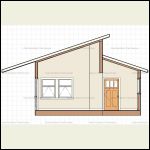
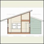
Here are some sections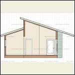
Section East
| 
Section West
| 
Section Bathroom West
|  |
|
|
rockies
Member
|
# Posted: 12 Apr 2015 06:08pm
Reply
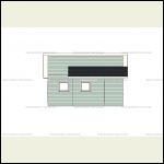
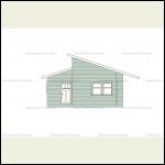
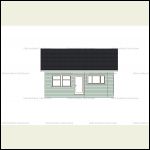
Here are the elevations. The decks don't show and there are posts missing from the porch roof overhangs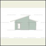
East Elev
| 
North Elev
| 
West Elev
| 
South Elev
|
|
|
rockies
Member
|
# Posted: 12 Apr 2015 06:31pm
Reply
When I first began my career as an Architect, I couldn't seem to design a house for myself that went below 2200 square feet. Then I heard about the "Solar Decathlon" event in Washington DC.
http://www.solardecathlon.gov/
It's an international competition to design a self sufficient home between 600-1000 square feet. Ever since finding this site I've been interested in the small home movement.
It's funny that the more I look at the smaller version of the original plan, I really prefer it to the larger cabin, and yet the smaller space still contains standard sized furniture and appliances and lots of prep areas and storage.
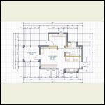
The smaller cabin would be only 352 sq' if the mudroom/entry was not built, or built later. As designed, the mudroom has space for a washer next to the front door, a seating bench with shoe storage below, large cabinets for pantry storage, and an area tucked away next to the window to hang coats on hooks.
The main living space has a queen sized Murphy bed on the north wall, clothes closets in the corner, and a built-in sofa bench with storage drawers underneath. This bench can also serve as the seating area for a roll away dining table.
The kitchen has a standard sized stove and fridge on the north wall, and a large sink in between two cabinets in the bump-out. There's about 8 feet of counter space in the kitchen.
The bathroom has a large vanity with sink, an over size tub and room for a composting toilet. There is a "barn style" sliding door outside the bathroom. Linen storage can be in the mudroom cabinets.
The nice thing about using the simple shed roof over the main room is that there is a lot of height along the north wall, so double height storage can be put over the Murphy bed, and there is a loft space over the bathroom.
Utilities are in a separate outbuilding nearby. If necessary, the mudroom could be "flipped" so that the entrance faces east, and an extra door put in on the west wall to a storage area added on the west side of the mudroom. That would increase the square footage of the cabin by 48 sq'. The washer and pantry cabinets could be moved in there, allowing for a coat closet in the mudroom.
Let me know if you have any questions or suggestions. Thanks.
|
|
rockies
Member
|
# Posted: 20 Apr 2015 07:24pm - Edited by: rockies
Reply
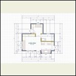
Well, here it is! The final version. I decided that the space next to the Murphy bed on the left side was too tight at 1'6", so I added an extra foot to the length of the livingroom. To keep the plan symmetrical I added an extra foot to the right side for the kitchen and bathroom. So now the cabin is 2 feet longer, adding 28 square feet to the plan. This small change allows me to align cabinetry in the kitchen so that the stove is centered in the kitchen window, and I widened the kitchen nook so that the window was now 6 feet 6 inches, the same proportions as the two livingroom windows plus the center post between them (3' + 6" + 3').
I also moved the bathroom window 6" east so that it would be vertically aligned with the clerestory window added underneath the main roofline on the north wall. By moving the bathroom window it means that the composting toilet will move east so that it is centered on the window, and the vanity is now longer. There is still room for an oversize tub.
These are the sort of little changes that give me a lot of satisfaction, but also cause a lot of frustration. I'm always checking and rechecking designs to see if there is a way to make things flow more smoothly. For example, if there's one thing I hate it's doors or windows that are out of alignment across a wall, or doorways that are off-center at the end of a hallway. It's as if someone puts a whole bunch of windows in with the tops lining up at 80" off the floor and then puts in one window at 76". People always notice it (even subconsciously) and they think something "isn't quite right" about the room. It drives me nuts.
So I spend far too much time checking sight-lines, figuring out where window and door trim should go, etc, so everything looks "level" across a room.
Anything drive you nuts about designing your cabin?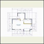
Final Floorplan
| 
Final Layout
|  |  |
|
|
rockies
Member
|
# Posted: 20 Apr 2015 07:35pm
Reply
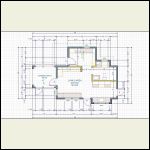
Foundation is made out of wooden beams resting on support pillars, and these hold up a SIP floor.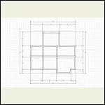
Foundation Plan
| 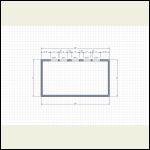
Upper Roof Window layout
|  |  |
|
|
rockies
Member
|
# Posted: 20 Apr 2015 07:37pm
Reply
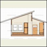
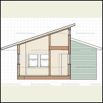
There is a loft space over the bathroom, and the sections show the clerestory windows. Only the center clerestory will open to allow a thermo-syphon effect for cooling.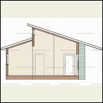
Section Looking East
| 
Section Looking West
| 
Bathroom Section Looking West
|  |
|
|
|
rockies
Member
|
# Posted: 20 Apr 2015 07:39pm - Edited by: rockies
Reply
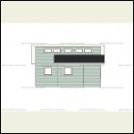
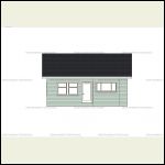
The elevations. The cabin is 2' longer than before, there are clerestory windows along the upper north wall, and the kitchen window and nook are widened to match the spacing of the livingroom windows. The bathroom window on the lower left was moved 6" left to line up underneath the clerestory window above it.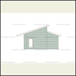
East Elev
| 
North Elev
| 
West Elev
| 
South Elev
|
|
|
rockies
Member
|
# Posted: 29 Apr 2015 08:37pm
Reply
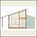
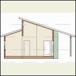
OH! The unending joy! I finally finished the sections and elevations after some adjustments! Once the calculations came back from the engineer, I discovered I needed a bit more height above the clerestory windows for support beams, so I decided to lengthen the roof over the porch a couple of feet and raised the entire roof about a foot. I can now get the right sized beam in above the clerestories and also allow for a bigger support beam at the edge of the porch roof.
I had to adjust the windows in the living room so that when you're either standing or sitting you don't have a window sash divider right at eye level.
I'm also going to put in a couple of skylights in the porch roof so there's more light in the kitchen and living room.
Once the engineer stamps the final drawings it's on to construction!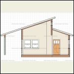
Section West
| 
Bathroom Section West
| 
Section East
|  |
|
|
rockies
Member
|
# Posted: 29 Apr 2015 08:39pm
Reply
Final Elevations. The decks don't show in these elevations for the front door and the south porch.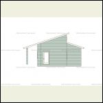
East Elev
| 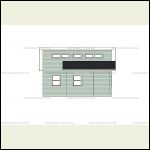
North Elev
| 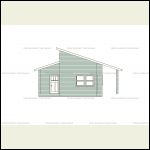
West Elev
| 
South Elev
|
|
|
rockies
Member
|
# Posted: 7 May 2015 06:29pm
Reply
A final (hopefully) version.
I can tell by the lack of responses that everyone here doesn't really know what to make of this thread. Is it a building study, is he really going to build it, is he asking for advice?
Well, it's all three.
This is a cabin that I'll be building in the next 5 months. All the materials will be cut off site so that the actual on-site assembly goes fast. I don't want to do any cutting or figuring out what's not quite right happening out in the wilderness.
This thread is also an opportunity to show how the design process evolves as you reconsider certain things and add in things you forgot or didn't know you needed.
For example, one point made to me by a couple of people was "You don't have a screen porch? You'll be eaten alive by bugs"! Hmmm, how true. The best place for a screen porch is on the west side to protect the cabin from the low angle of the setting sun, and the only way to get to it from inside was to move the built-in sofa.
Someone else said that the south porch overhang was way too deep and would create dark interiors. Also true. So as the porch roof is cut back the height of the roof drops since I wanted to keep all the eave lines at the same height off the ground (although I may raise the main roof again in order to keep the clerestory windows on the north wall).
I also realized that having the washing machine in a cabinet next to the front door was dumb (!) so I put it in a bump-out in the bathroom and added some laundry cabinets. Now all the plumbing is in the same area.
One series of books that have been very helpful in designing a small space are Sarah Susanka's books based on her original book "The Not So Big House". Her follow-up book on designing interior storage solutions called "Not So Big Solutions for your Home" takes you room by room through a typical house and asks "what do you need in the entranceway, what should be there in the bathroom" in order to properly store all the stuff you use everyday. Even when I'm designing a house for someone I'm always surprised about the number of people who never consider where they want to put the computer, where does all the mail go, where do the old newspapers go, etc.
This is the sort of process I would go through if I was designing a cabin for you. Here's to version 8.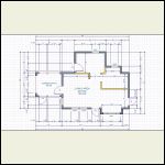
Floor Plan
| 
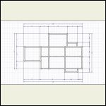
Layout Plan
| 
Foundation Plan
| 
Roof Plan
|
|
|
rockies
Member
|
# Posted: 7 May 2015 06:30pm
Reply
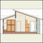
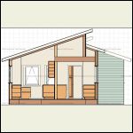
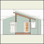
Sections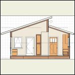
Section West
| 
Section East
| 
Section West Bathroom
| 
Section East Porch
|
|
|
rockies
Member
|
# Posted: 7 May 2015 06:31pm
Reply
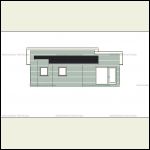
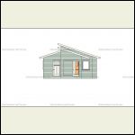
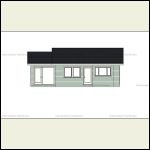
Elevations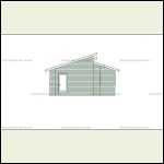
East Elev
| 
North Elev
| 
West Elev
| 
South Elev
|
|
|
|

